
Monkiri (Redesign)
PRODUCT DESIGN + VISUAL DESIGN
Connecting and simplifying visual elements to facilitate learning, while bringing in moments of delight in the learning process.
Project Type: V2: Complete Redesign Of Mobile App & Learning Management System, V1: 1-Week Mobile App MVP Redesign Project (March 2019-2021)
Team Members: Founder/ Product Manager, User Researcher, Content Creators, Data Analyst, Developers
My Roles: Product Design, Visual Design, Branding
Programs: Illustrator, Figma, InVision
Results: Secured funding from organizations with the first MVP redesign followed by 100+ downloads and active users as of 2020, a majority of positive feedback from users (learners) on the latest redesign concepts
Monkiri is a mobile e-learning platform focusing on financial literacy and inclusion. The platform aims to help people, especially those from emerging economies, learn about core financial concepts and make it easier for them to connect with relevant financial service providers. Monkiri realizes that 70% of people in emerging economies don’t know the rules because they lack the understanding of the essential concepts. Without being able to understanding the concepts, it means that over 2 billion people are excluded from financial services.
In March 2019, as a UX/UI Designer, I helped redesign the current (Android) interface and experience for the MVP based on user feedback from testing. I also aimed to establish and integrate the overall brand look into the experience. As most people in emerging economies are not too familiar with tech, apps and English, I had to keep that in mind and use icons as well (which I recreated). I took on the opportunity to design on the team as it was a meaningful initiative for me in helping those in need.
As of March 2020, the app has hundreds of downloads and active users within Southeast Asia and Canada.
In March 2020, as a Product Designer, I was hired for a 6-month full time contract on the team to further redesign the mobile app based on the user testing gathered throughout the past year. We needed to make the app appeal to both youth and adults, as well as consider the usability for American and international markets. I also redesigned the Learning Management System to allow content creators and our partners to easily add and manage lessons and students. It was a very complicated process and a lot to consider and implement after rounds of research and user testing.
LATEST DESIGN (V2) - ON ANDROID FOR SOUTHEAST ASIAN USERS

PREVIOUS DESIGN MOCKUPS (V1)

Previous redesign V1 of the main interfaces from the course experience to exploring financial service providers (2019)
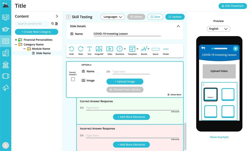
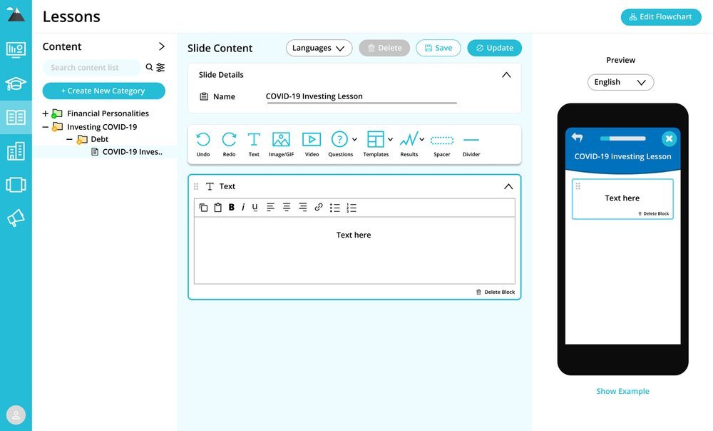
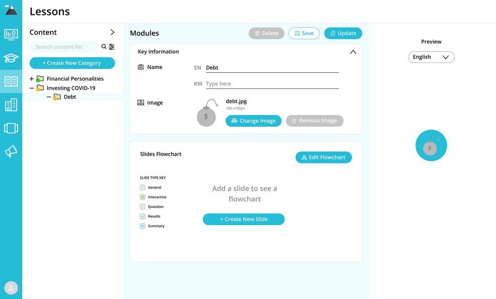
LEARNING MANAGEMENT SYSTEM BACKEND FOR CONTENT PARTNERS
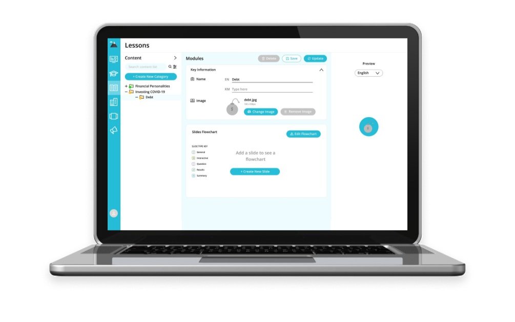
Learning Management System redesign for our content partners to build content on the app (2021)
THE V1 INITIAL PROCESS (1 WEEK)
Persona
With only one week to redesign the existing UX and UI for our MVP, I had to start off with our persona. The team had previously had a target audience in mind through user research, but I felt that we should have an actual persona laid out to visualize exactly who we are designing for. Here is the persona I put together based on our research.

Our persona, Kiry (Adam)
Flow Diagram
With the feedback we received from our previous prototype, I considered the overall user flow for the refined MVP. Our main parts that help Kiry (Adam) achieve his goals is through Lessons, Profile, Services and Challenges. The stickies in green are the main sections, the yellow ones are secondary and the orange ones future considerations after we present our MVP. By laying this out, I was able to focus on how to improve the existing interactions and experience. In our research, we looked at other learning apps such as Duolingo, Mimo and Headspace. Although for different types of topics, we wanted to look into the flow of the learning experience. Many of them had characters guiding the user throughout, which we aim to integrate into Monkiri after we test out our MVP.

Flow diagram for Monkiri
Sketches + Mockups
In redesigning Monkiri based on user feedback, I sketched out possible layouts and interactions.

Sketches for the redesign of Monkiri
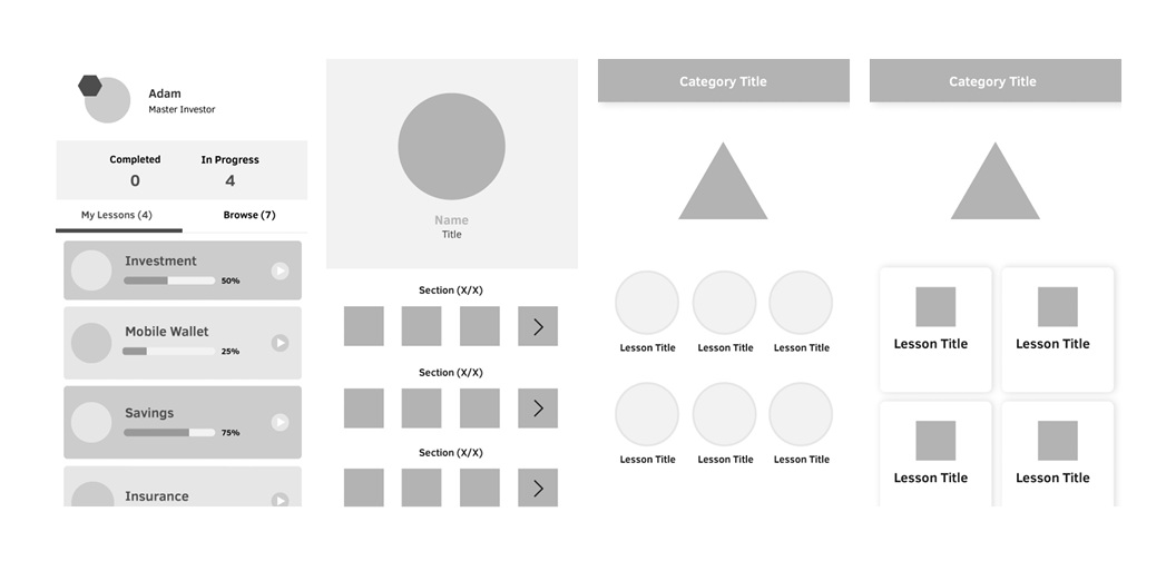
Some of the mockups for the redesign of Monkiri
Design Guide
Working with a developer and also as reference for other team members, I put together a design guide. I wanted to integrate an overall brand colour to the app and also redid the icons and illustrations for a more cohesive look. As this was done early in my career, I plan to revise the design guide.

Design guide for Monkiri
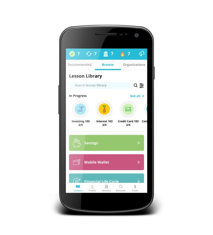
THE FINAL V1 REDESIGN
The redesign was for our persona, Adam, who is a young adult looking to expand his knowledge in managing finances. He does not have as much technical experience so the interface had to be very natural and simple.

Lessons UX and UI redesigned

Lessons UX and UI redesigned

Lessons UX and UI redesigned

Lessons UX and UI redesigned

Profile UX and UI redesigned

Services UX and UI redesigned

Services UX and UI redesigned

Challenges UX and UI redesigned
THE V2 REDESIGN PROCESS (6 MONTHS)
NOTE: Due to the nature of this project that’s still in the development phase, only a limited amount of content can be shared.
Coming back in from my previous designs above after about a year, the goal was to gather as much data and user feedback to set up the direction for the second redesign of the app. The company has since rolled out the app in both the North American market, as well as Southeast Asia, and made an impact on thousands of users. As more partners joined the platform to build financial content, we needed a Learning Management System (LMS) to empower our financial partners to create content. The current system in place has not been completely tested yet so the experience may not be the most ideal. My role was to go in and conduct research and make improvements to the experience and interface, while taking into consideration the strategic initiatives of the company.
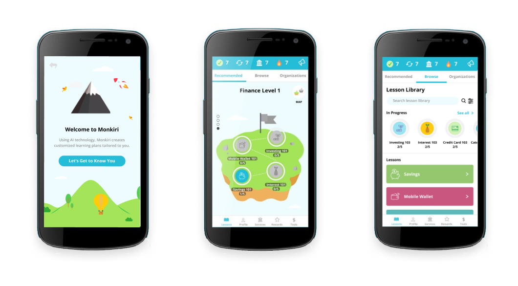
V2 Android designs for Southeast Asian users
USER RESEARCH, FEEDBACK, AND FLOW ANALYSIS
After conducting some research on our existing user base, I put together another new persona and also mapped out the end-to-end user flow to see where we could improve the steps and processes. From there, mockups and prototypes were developed with the brand vision in mind (fun yet professional) after rounds of sketching, wireframing, and feedback gathering. I worked together with our development, user testing, content strategy, marketing, and data analysis team members in building out the prototype for both the app and LMS.
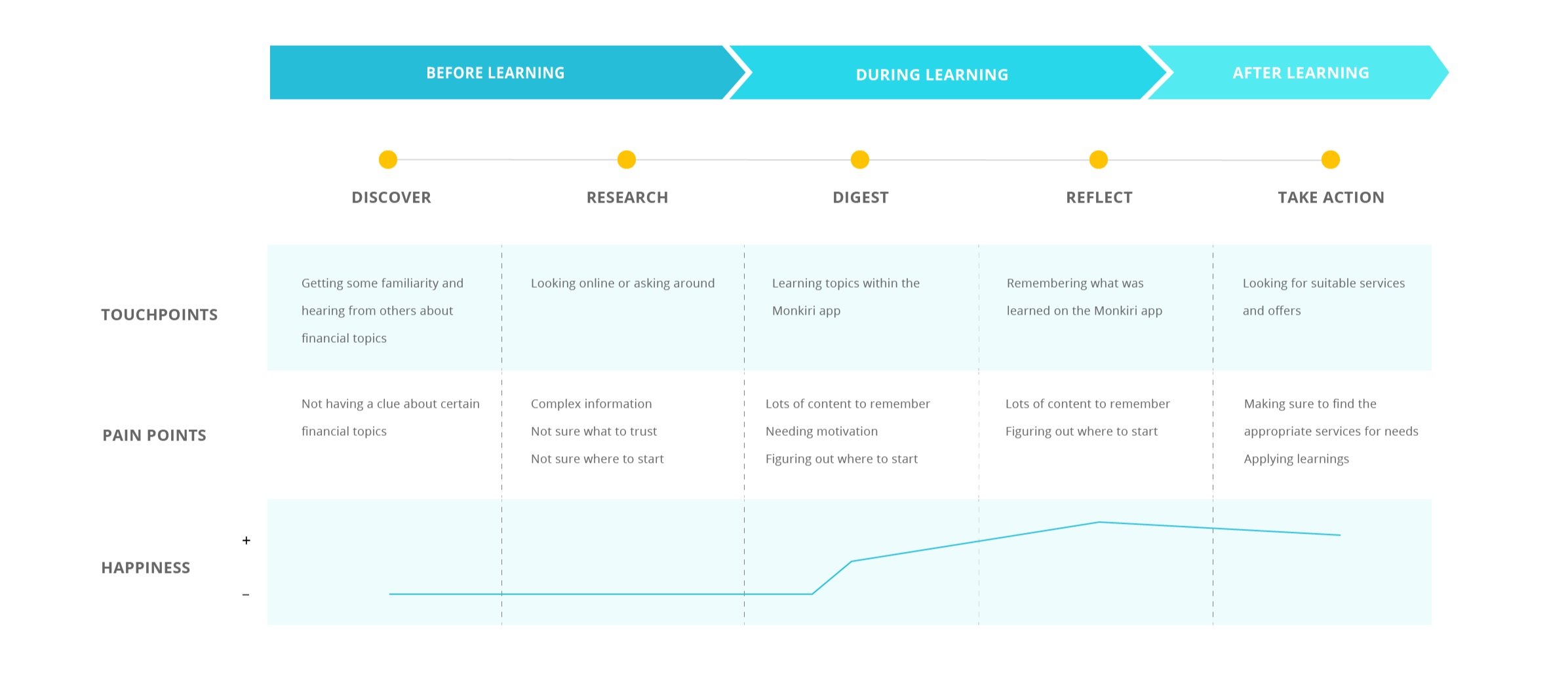
Journey Framework
I also leveraged and referenced existing design patterns that would make sense to our users who have likely had experience with platforms such as Google Drive (for our financial partners) and other apps (for our learners). The challenge was mainly finding a balance between designing for the American and the Southeast Asian users as both were different culturally and in their technical competencies. The key reiterations of the previous version of the app was gamification on the financial learning experience. I took broad ideas from users and my team and mocked up various versions of how we can approach gamification. The final design was inspired by Mario and Duolingo, where users can navigate different worlds and unlock challenges with various difficulties.
We then set up user testing and feedback sessions throughout the different versions to for our user groups and financial partners. I presented our ideas and prototypes and also facilitated the sessions. It was amazing working with our supporters and having them provide input on the platforms!

Content Management System redesign
REFLECTION
The redesign gained a lot of positive feedback from the team and will be set for more user feedback. As our test group is in Cambodia, it takes quite some time to get user feedback. Overall, I was glad to help redesign such a meaningful product that will be helping many people. It is also a great experience to work with developers to get this product built. We are currently working on integrating a friendly character that will help guide users throughout the experience, ensuring that they understand the functions and interactions. An interactive prototype will be available shortly and I will continue to refine the experience and interface of Monkiri.